R packages that make ggplot2 more powerful (Vol. II)
By Tuo Wang in Data Visualization ggplot2
April 5, 2021
In this post, I will continue exploring R packages that make ggplot2 more powerful. Still, I will use the penguins data as illustration. The first part of this tutorial can be found
here. Same as previous tutorial, first we need to load the data, add fonts and set the ggplot theme.
# Load packages
library(tidyverse)
library(palmerpenguins)
library(showtext)
library(ggdist)
library(ggtext)
library(patchwork)
library(ggforce)

#data(package = 'palmerpenguins')
font_add_google("Roboto", "roboto")
font_add_google("Roboto Slab", "roboto slab")

showtext_auto()

theme_set(theme_bw())
theme_update(
  text = element_text(family = "roboto", size = 8, color = "black"),
  plot.title = element_text(family = "roboto", size = 15,
                            face = "bold", color="#2a475e"),
  plot.subtitle = element_text(family = "roboto", size = 10,
                               face = "bold", color="#1b2838"),
  plot.caption = element_text(size = 10),
  axis.title.y = element_text(face="bold", angle=90),
  axis.title.x = element_text(face="bold"),
  axis.text.x = element_text(size = 10, color = "black"),
  axis.text.y = element_text(size = 10, color = "black"),
  axis.title = element_text(size=12),
  rect = element_blank(),
  panel.grid = element_line(color = "#b4aea9"),
  panel.grid.minor = element_blank(),
  panel.grid.major.x = element_blank(),
  plot.title.position = "plot",
  panel.grid.major.y = element_line(linetype="dashed"),
  axis.ticks = element_blank(),
  axis.line = element_line(colour = "grey50"),
  plot.background = element_rect(fill = '#fbf9f4', color = '#fbf9f4')
)

col_palette <-  c("#386cb0","#fdb462","#7fc97f")
Create a new column called bill_ratio and transform the species variable to a numeric variable.
penguins_comp <- penguins %>%
  mutate(bill_ratio = bill_length_mm / bill_depth_mm) %>%
  mutate(species_num = as.numeric(fct_rev(species))) %>%
  drop_na()

head(penguins_comp)
## # A tibble: 6 × 10
##   species island bill_length_mm bill_depth_mm flipper_length_… body_mass_g sex
##   <fct>   <fct>           <dbl>         <dbl>            <int>       <int> <fct>
## 1 Adelie  Torge…           39.1          18.7              181        3750 male
## 2 Adelie  Torge…           39.5          17.4              186        3800 fema…
## 3 Adelie  Torge…           40.3          18                195        3250 fema…
## 4 Adelie  Torge…           36.7          19.3              193        3450 fema…
## 5 Adelie  Torge…           39.3          20.6              190        3650 male
## 6 Adelie  Torge…           38.9          17.8              181        3625 fema…
## # … with 3 more variables: year <int>, bill_ratio <dbl>, species_num <dbl>
1. Easy work with text using ggtext package
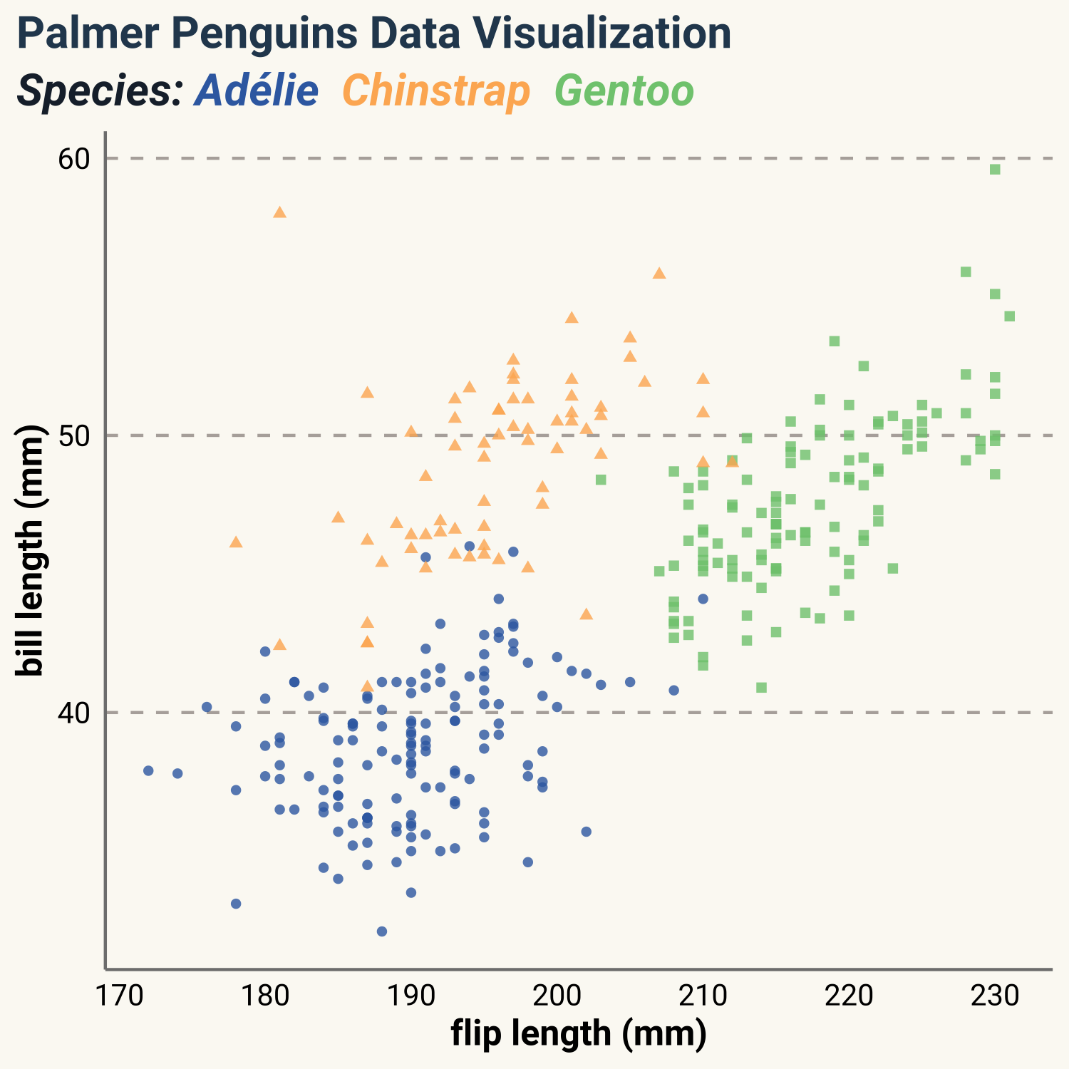
ggtext is a powerful package for dealing with text when plotting in R. It enables us to use HTML and markdown style. For example, in
previous tutorial, we plotted the scatter plot of flip length versus bill length and used color as legend to show different species. However, we can delete the legend and use different color of text in the title. Just use element_markdown() inside theme(), then we can use HTML and markdown style. For example, we can make italic text by *text* and we can assign color by <span style='color:#386cb0'>text<span>.
penguins_comp %>%
  ggplot(aes(x=flipper_length_mm, y=bill_length_mm)) +
  geom_point(aes(color=species, shape=species), size=1.3, alpha=0.8,show.legend = FALSE) +
  scale_color_manual(values = c("#386cb0","#fdb462","#7fc97f")) +
  labs(
    title = "Palmer Penguins Data Visualization",
    subtitle ="Species: <span style='color:#386cb0'>Adélie<span>
    <span style='color:#fdb462'>Chinstrap<span>
    <span style='color:#7fc97f'>Gentoo<span>",
    x = "flip length (mm)",
    y = "bill length (mm)") +
  theme(plot.subtitle = ggtext::element_markdown(
    family = "roboto", size = 15,face = "bold",),
    axis.title.y = element_text(face="bold",angle=90),
    axis.title.x = element_text(face="bold"),
    axis.text.x = element_text(size = 10, color = "black"),
    axis.text.y = element_text(size = 10, color = "black"))
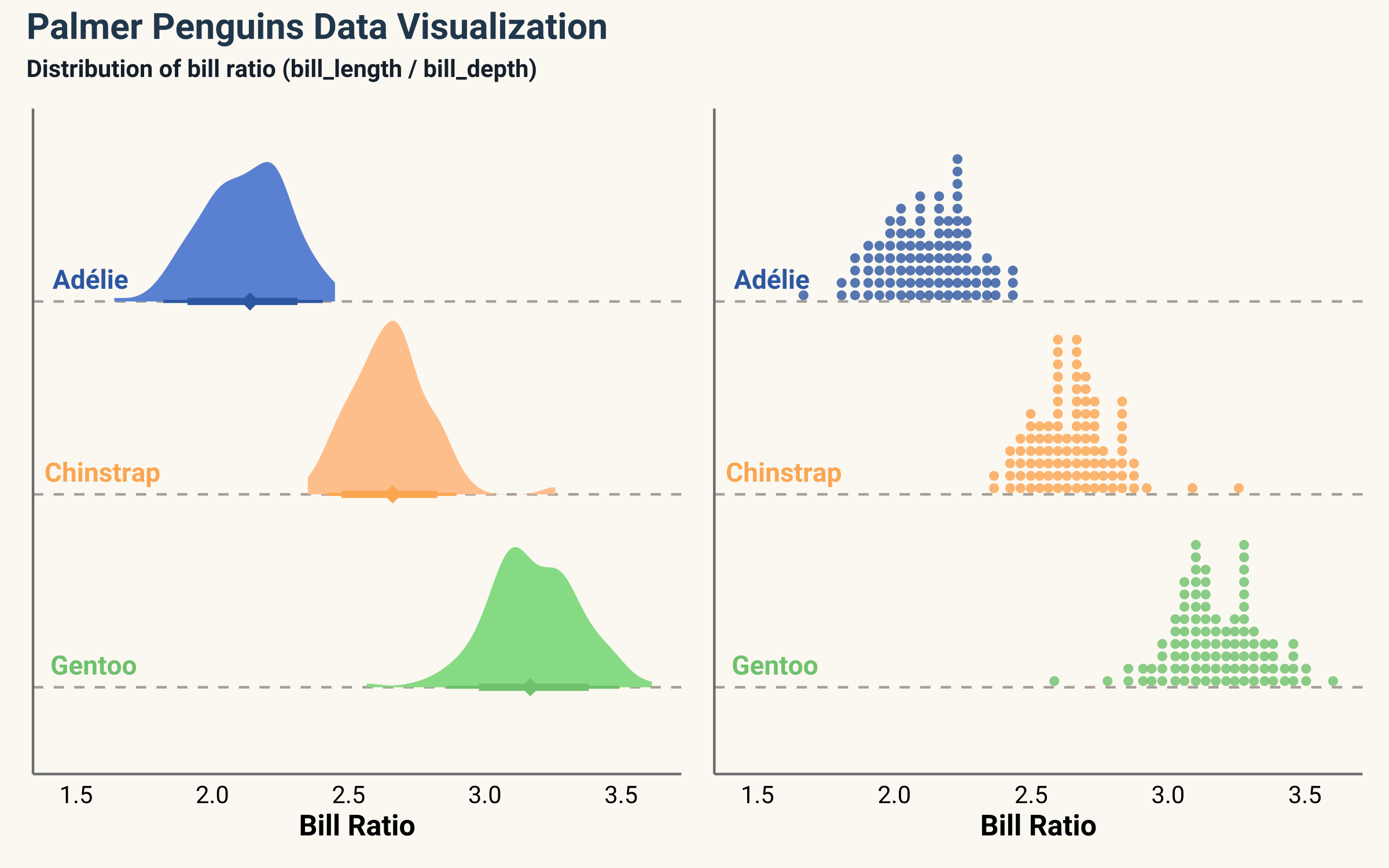
2. Visualizing distributions using ggdist package
ggdist is a powerful package for visualizing distributions. ggdist package enables us to use dot and eye plots instead of common density plots.
p1 <- penguins_comp %>%
  ggplot() +
  ggdist::stat_halfeye(
    aes(x=bill_ratio, y= species_num,
        color=species,
        fill=ggplot2::after_scale(colorspace::lighten(color, 0.3))),
    shape=18, show.legend = FALSE,
    .width = c(0.8, 0.95), point_size = 3) +
  ggtext::geom_richtext(data=text_df, aes(x=x,y=y,label=label), hjust=0.2,
            show.legend = FALSE, fill = NA, label.color=NA,
            family="roboto",fontface = "bold") +
  scale_color_manual(values = col_palette) +
  scale_fill_manual(values = col_palette) +
  coord_cartesian(clip = "off") +
  labs(x = "Bill Ratio") +
  scale_y_continuous(
    limits = c(.55, NA),
    breaks = 1:3,
    expand = c(0, 0))

p2 <- penguins_comp %>%
  ggplot() +
  ggdist::stat_dots(
    aes(x=bill_ratio, y= species_num,
        color=species), alpha=0.8, quantiles = 100,
    dotsize = 1.35,
    shape=16, show.legend = FALSE,
    .width = c(0.8, 0.95), ) +
  ggtext::geom_richtext(data=text_df, aes(x=x,y=y,label=label), hjust=0.2,
                show.legend = FALSE, fill = NA, label.color=NA,
                family="roboto",fontface = "bold") +
  scale_color_manual(values = col_palette) +
  scale_fill_manual(values = col_palette) +
  coord_cartesian(clip = "off") +
  labs(x = "Bill Ratio") +
  scale_y_continuous(
    limits = c(.55, NA),
    breaks = 1:3,
    expand = c(0, 0))

p1 + p2 +
  plot_annotation(
    title = "Palmer Penguins Data Visualization",
    subtitle = "Distribution of bill ratio (bill_length / bill_depth)") &
  theme(  axis.title.y = element_blank(),
          axis.text.y = element_blank())
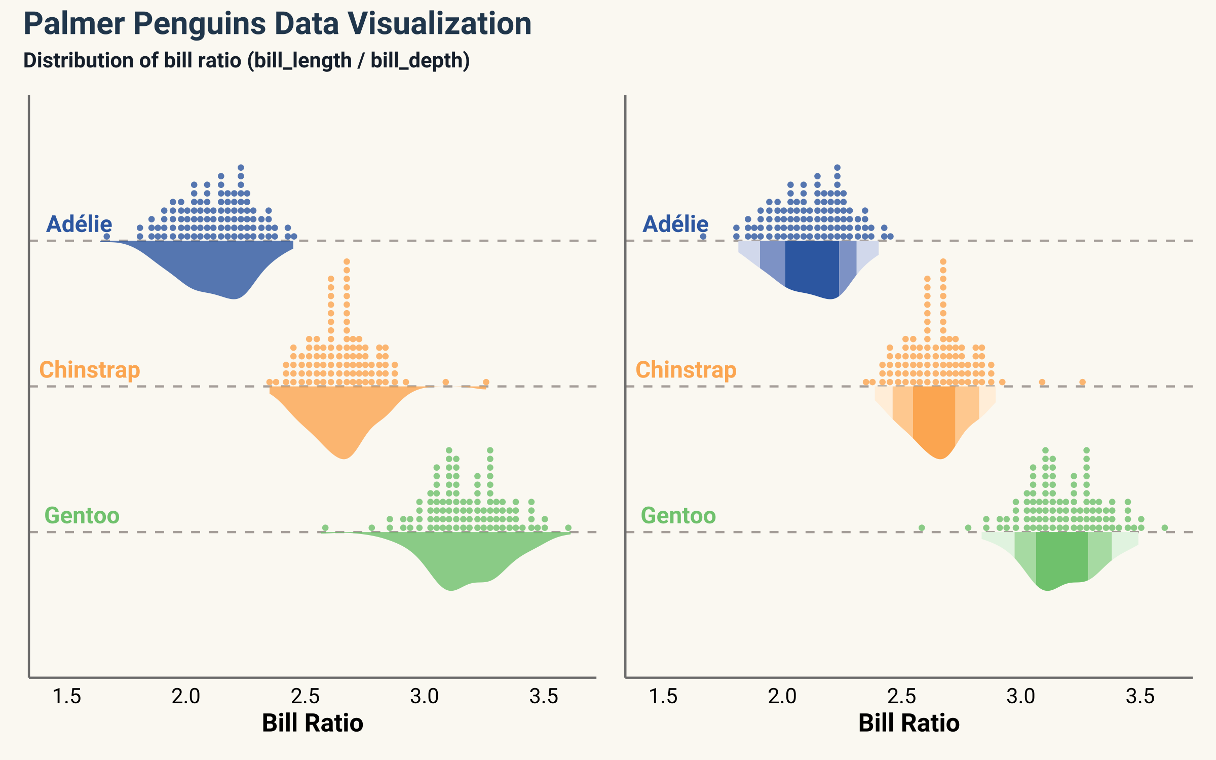
We can also combine the density and dot plots together. cut_cdf_qi function in ggdist package helps us to visualize the density plot with smooth fill colors.
p3  <- penguins_comp %>%
  ggplot() +
  ggdist::stat_dots(
    aes(x=bill_ratio, y= species_num,
        color=species), alpha=0.8, quantiles = 100,
    dotsize = 1.3,
    shape=16, show.legend = FALSE,
    .width = c(0.8, 0.95), )  +
  ggdist::stat_slab(
    aes(x=bill_ratio, y= species_num,fill=species),alpha=0.8,
    show.legend = FALSE, side = "bottom", scale = 0.5) +
  ggtext::geom_richtext(
    data=text_df, aes(x=x,y=y,label=label), hjust=0.2,
    show.legend = FALSE, fill = NA, label.color=NA,
    family="roboto",fontface = "bold") +
  scale_color_manual(values = col_palette) +
  scale_fill_manual(values = col_palette) +
  coord_cartesian(clip = "off") +
  scale_y_continuous(
    limits = c(0.0, NA),
    breaks = 1:3,
    expand = c(0, 0)) +
  labs(x = "Bill Ratio")

p4 <- penguins_comp %>%
  ggplot() +
  ggdist::stat_dots(
    aes(x=bill_ratio, y= species_num,
        color=species), alpha=0.8, quantiles = 100,
    dotsize = 1.3,
    shape=16, show.legend = FALSE,
    .width = c(0.8, 0.95), )  +
  ggdist::stat_slab(
    aes( y= species_num,x=bill_ratio,
        fill=species,
        fill_ramp = stat(cut_cdf_qi(
          cdf, .width = c(.5,.8, .95),
          labels = scales::percent_format()
        ))
    ),side = "bottom", scale = 0.5, show.legend = FALSE) +
  scale_fill_ramp_discrete(range = c(1, 0.2), na.translate = FALSE) +
  ggtext::geom_richtext(
    data=text_df, aes(x=x,y=y,label=label), hjust=0.2,
    show.legend = FALSE, fill = NA, label.color=NA,
    family="roboto",fontface = "bold") +
  scale_color_manual(values = col_palette) +
  scale_fill_manual(values = col_palette) +
  coord_cartesian(clip = "off") +
  scale_y_continuous(
    limits = c(0.0, NA),
    breaks = 1:3,
    expand = c(0, 0)) +
  labs(x = "Bill Ratio")

p3 + p4 +
  plot_annotation(
    title = "Palmer Penguins Data Visualization",
    subtitle = "Distribution of bill ratio (bill_length / bill_depth)") &
  theme(  axis.title.y = element_blank(),
          axis.text.y = element_blank())
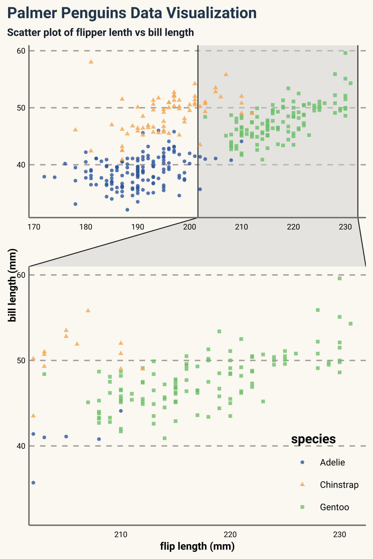
3. ggforce package
ggforce is another powerful package with many useful geoms. With ggforce, we can label the plot easily, highlight a certain area of figure and many other useful plots such as link plot and circle bar plot. Here I only list three of them for illustration.
zoom in the figure of a certain category:
penguins_comp %>%
  ggplot() +
  geom_point(
    aes(x=flipper_length_mm, y=bill_length_mm,color=species, shape=species),
    size=1, alpha=0.8) +
  ggforce::facet_zoom(x = species == "Gentoo",zoom.size = 1.5) +
  scale_color_manual(values = col_palette) +
  labs(title = "Palmer Penguins Data Visualization",
       subtitle = "Scatter plot of flipper lenth vs bill length",
       x = "flip length (mm)",
       y = "bill length (mm)") +
  theme(
    plot.title = element_text(family = "roboto", size = 12,
                              face = "bold", color="#2a475e"),
    plot.subtitle = element_text(family = "roboto", size = 8,
                                 face = "bold", color="#1b2838"),
    legend.text = element_text(size=7, family = "roboto"),
    legend.title = element_text(face="bold", size=10, family = "roboto"),
    legend.position = c(1,0),
    legend.justification = c(1, 0),
    axis.title.y = element_text(face="bold",angle = 90,size=8),
    axis.title.x = element_text(face="bold",size=8),
    axis.text.x = element_text(size = 6, color = "black"),
    axis.text.y = element_text(size = 6, color = "black"))
highlight certain category
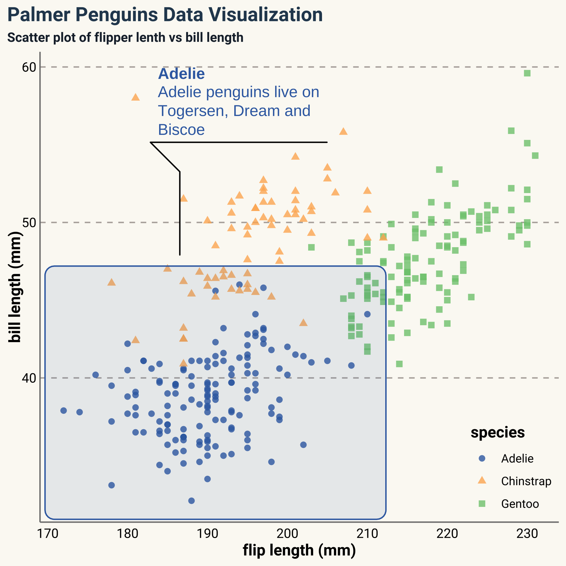
penguins_comp %>%
  ggplot() +
  geom_point(
    aes(x=flipper_length_mm, y=bill_length_mm,color=species, shape=species),
    size=2, alpha=0.8) +
  ggforce::geom_mark_rect(
    aes(x=flipper_length_mm, y=bill_length_mm,color=species,fill=species,
        label=species,filter = species == 'Adelie',
        description="Adelie penguins live on Togersen, Dream and Biscoe"),
    label.fill = NA, label.colour = c("#386cb0","#386cb0"),
    show.legend=FALSE,alpha=0.1) +
  scale_color_manual(values = col_palette) +
  scale_fill_manual(values = col_palette) +
  labs(title = "Palmer Penguins Data Visualization",
       subtitle = "Scatter plot of flipper lenth vs bill length",
       x = "flip length (mm)",
       y = "bill length (mm)") +
  theme(
    legend.text = element_text(size=9, family = "roboto"),
    legend.title = element_text(face="bold", size=12, family = "roboto"),
    legend.position = c(1,0),
    legend.justification = c(1, 0),
    axis.title.y = element_text(face="bold",angle = 90),
    axis.title.x = element_text(face="bold"),
    axis.text.x = element_text(size = 10, color = "black"),
    axis.text.y = element_text(size = 10, color = "black"))
Circle bar plots:
penguins_comp %>%
  count(species) %>%
  mutate(focus=ifelse(species=="Chinstrap", 0.2, 0)) %>%
  ggplot() +
  ggforce::geom_arc_bar(
    aes(x0 = 0, y0 = 0, r0 = 0.8, r = 1, amount = n, fill = species,explode = focus),
    alpha = 0.3, stat = "pie") +
  scale_fill_manual(values = col_palette) +
  theme(
    legend.text = element_text(size=4, family = "roboto"),
    legend.title = element_text(face="bold", size=6, family = "roboto"),
    legend.key.size = unit(0.35, 'cm'),
    legend.position = c(0.6,0.45),
    legend.justification = c(1, 0),
    axis.title.x = element_blank(),
    axis.text.x = element_blank(),
    panel.grid.major.y = element_blank(),
    axis.line = element_blank()
    )

Additional resources:
ggplot2: Elegant Graphics for Data Analysis
Beautiful plotting in R: A ggplot2 cheatsheet