R packages that make ggplot2 more beautiful (Vol. I)
By Tuo Wang in Data Visualization ggplot2
March 25, 2021
In this tutorial, I will introduce some additional R packages that help
ggplot2 make better visualizations. To make better data visualizations, it is inevitably to manipulate the dataframe often. I recommend using
tidyverse for data cleaning and data wrangling. If you are not familiar with tidyverse, here is a great
beginner tutorial. I will use the penguins data from the
palmerpenguins R package for illustration. In this tutorial, I will briefly introduce three packages: showtext, patchwork and ggrepel with some examples.
1. Load Data
First, we need to load the data from palmerpenguins package. The package contains two dataframe penguins and penguins_raw.
library(tidyverse)
library(palmerpenguins)
data(package = 'palmerpenguins')
We can use the skim function from
skimr package to take a glance at the dataset.
library(skimr)
skim(penguins)
skim(penguins_raw)
The outputs of the skim(penguins) are too long. Here is the top 5 rows of the dataset.
head(penguins,5)
## # A tibble: 5 × 8
##   species island bill_length_mm bill_depth_mm flipper_length_… body_mass_g sex
##   <fct>   <fct>           <dbl>         <dbl>            <int>       <int> <fct>
## 1 Adelie  Torge…           39.1          18.7              181        3750 male
## 2 Adelie  Torge…           39.5          17.4              186        3800 fema…
## 3 Adelie  Torge…           40.3          18                195        3250 fema…
## 4 Adelie  Torge…           NA            NA                 NA          NA <NA>
## 5 Adelie  Torge…           36.7          19.3              193        3450 fema…
## # … with 1 more variable: year <int>
2. Using external fonts with showtext package
Sometimes changing the default font of ggplot2 can make our plots much more beautiful. Here, I want to introduce the
showtext, which makes the process of using new font in R much easier. The main function is font_add_google. First, go to
Google fonts and pick your favorite font. For example, I picked
“Lobster Two” and
“Roboto”.
library(showtext)
# download "Lobster Two" and save it as "lobstertwo"
font_add_google("Lobster Two", "lobstertwo")
font_add_google("Roboto", "roboto")
font_add_google("Poppins", "poppins")
showtext_auto()
Set the ggplot theme with new fonts.
theme_set(theme_bw())
theme_update(
  legend.text = element_text(size=9, family = "roboto"),
  legend.title = element_text(face="bold", size=12, family = "roboto"),
  legend.position = c(1,0),
  legend.justification = c(1, 0),
  text = element_text(family = "lobstertwo", size = 8, color = "black"),
  plot.title = element_text(family = "lobstertwo", size = 20,
                            face = "bold", color="#2a475e"),
  plot.subtitle = element_text(family = "lobstertwo", size = 15,
                               face = "bold", color="#1b2838"),
  plot.caption = element_text(size = 10),
  plot.title.position = "plot",
  #plot.caption.position = "plot",
  axis.text = element_text(size = 10, color = "black"),
  axis.title = element_text(size=12),
  axis.ticks = element_blank(),
  axis.line = element_line(colour = "grey50"),
  rect = element_blank(),
  panel.grid = element_line(color = "#b4aea9"),
  panel.grid.minor = element_blank(),
  panel.grid.major.x = element_blank(),
  #panel.grid.major.x = element_line(linetype="dashed"),
  #panel.grid.major.y = element_blank(),
  panel.grid.major.y = element_line(linetype="dashed"),
  plot.background = element_rect(fill = '#fbf9f4', color = '#fbf9f4')
)
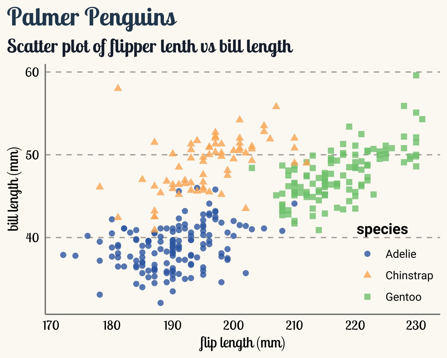
Remove rows with missing values.
# Delete rows with missing values
penguins_comp <- penguins %>%
  drop_na()
penguins_comp %>%
  ggplot(aes(x=flipper_length_mm, y=bill_length_mm)) +
  geom_point(aes(color=species, shape=species), size=2, alpha=0.8) +
  scale_color_manual(values = c("#386cb0","#fdb462","#7fc97f")) +
  labs(
    title = "Palmer Penguins Data Visualization",
    subtitle = "Scatter plot of flipper lenth vs bill length",
    x = "flip length (mm)",
    y = "bill length (mm)"
    )
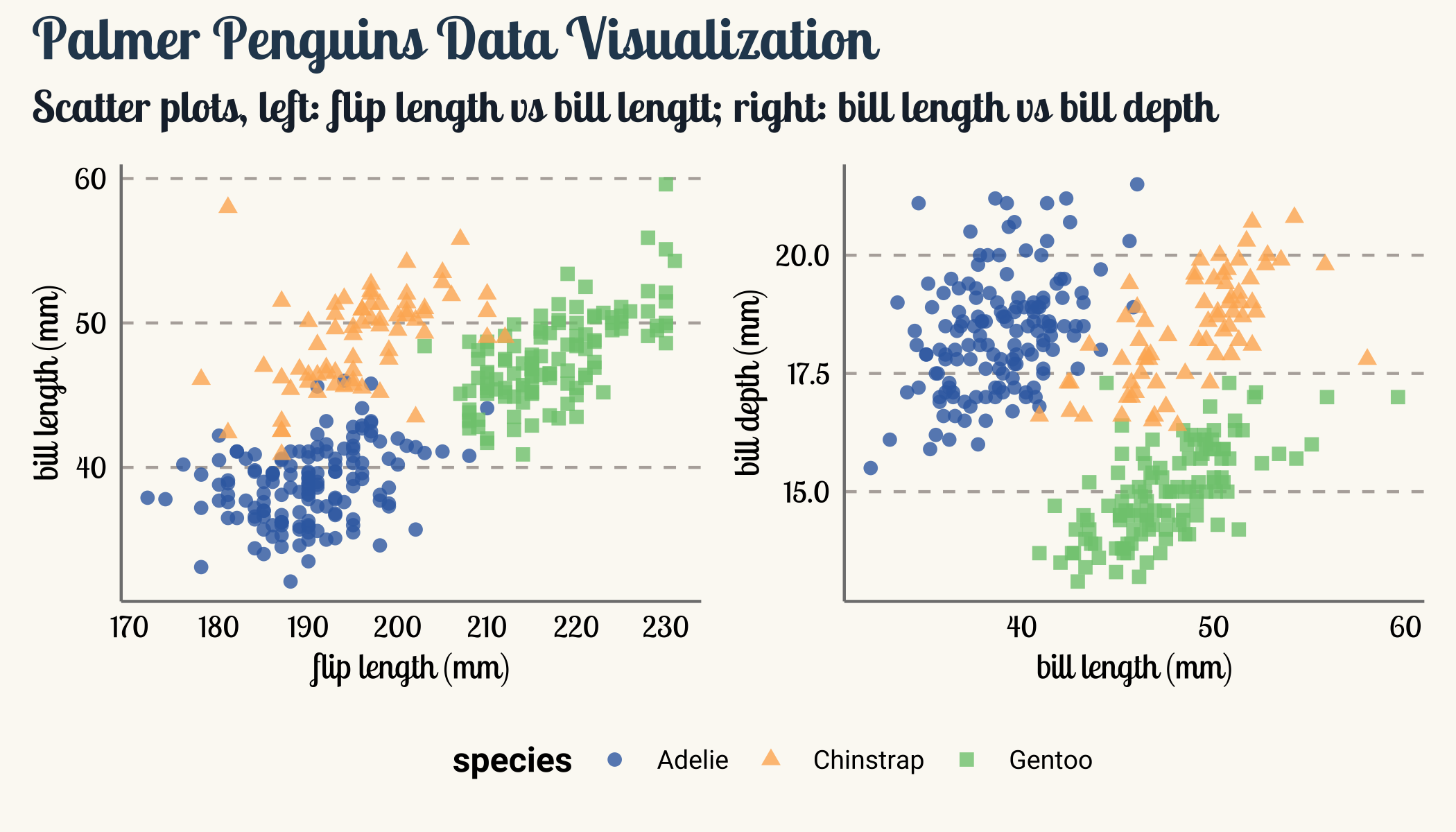
3. Combine plots with patchwork package
Sometimes, we would like to combine several plots into one figure. Here I want to introduce the powerful
patchwork package. The package is very easy to use. For example, if we want to combine two ggplot2 objects, say p1 and p2, then we can directly call p1+p2 to combine the two objects. Since p1 and p2 share the same legend, patchwork allows us to use only one legend and one title by calling functions plot_layout and plot_annotation. Finally use & to add additional theme options.
library(patchwork)
p1 <- penguins_comp %>%
  ggplot(aes(x=flipper_length_mm, y=bill_length_mm)) +
  geom_point(aes(color=species, shape=species), size=2, alpha=0.8) +
  scale_color_manual(values = c("#386cb0","#fdb462","#7fc97f")) +
  labs(x = "flip length (mm)",
       y = "bill length (mm)")

p2 <- penguins_comp %>%
  ggplot(aes(x=bill_length_mm, y=bill_depth_mm)) +
  geom_point(aes(color=species, shape=species), size=2, alpha=0.8) +
  scale_color_manual(values = c("#386cb0","#fdb462","#7fc97f")) +
  labs(x = "bill length (mm)",
       y = "bill depth (mm)")

p1 + p2 +
  plot_layout(guides = "collect") +
  plot_annotation(
    title = "Palmer Penguins Data Visualization",
    subtitle = "Scatter plots, left: flip length vs bill lengtt;
    right: bill length vs bill depth") &
  theme(legend.position = "bottom",
        legend.justification = "center")
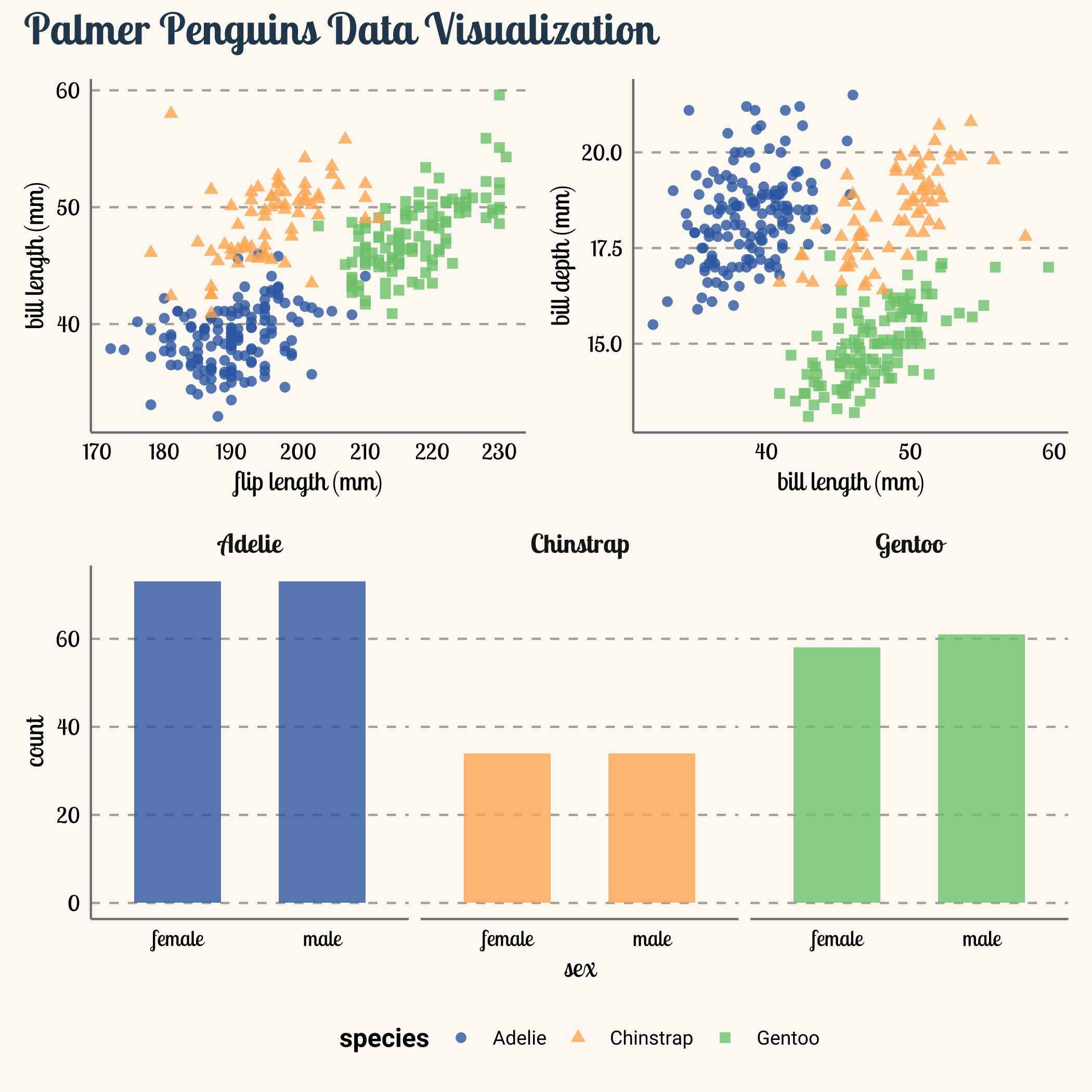
We can also use / to add a third plot in the bottom. patchwork only can combine legend of the same aesthetics. However, we can add show.legend=FALSE in the geom_bar to mute the legend representing fill.
p3 <- penguins_comp %>%
  ggplot(aes(x = sex, fill = species)) +
  geom_bar(alpha = 0.8,width=0.6, show.legend = FALSE) +
  scale_fill_manual(values = c("#386cb0","#fdb462","#7fc97f")) +
  facet_wrap(~species, ncol = 3) +
  theme(strip.text = element_text(size=12, face="bold"))

(p1 + p2) / p3 +
  plot_layout(guides = "collect") +
  plot_annotation(
    title = "Palmer Penguins Data Visualization") &
  theme(legend.position = "bottom",
        legend.justification = "center")
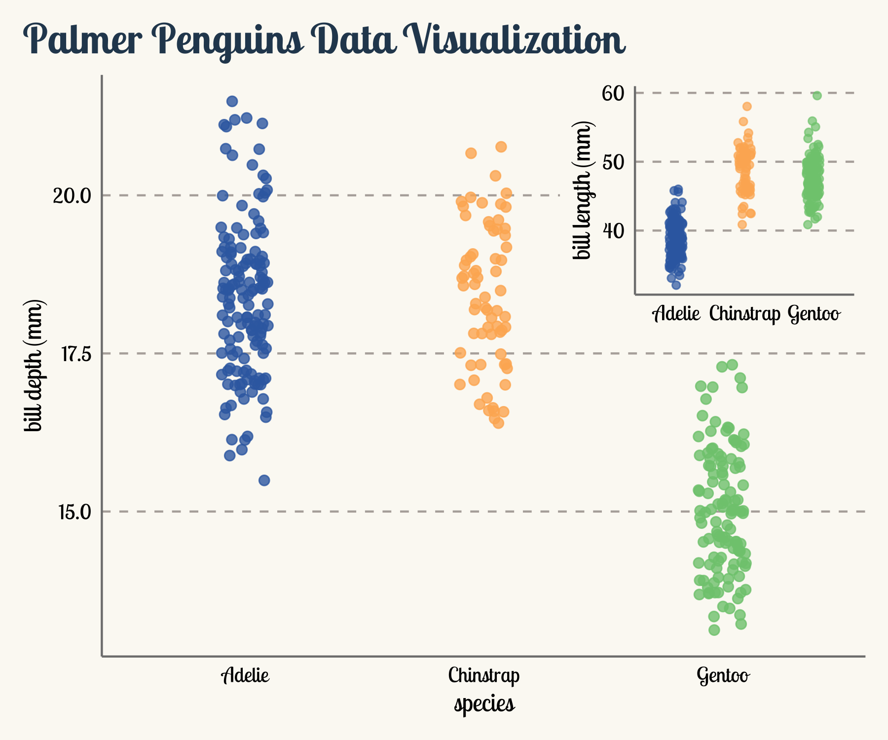
We can also inset one plot inside another plot.
p4 <- penguins_comp %>%
  ggplot() +
  geom_jitter(aes(x=species, y=bill_depth_mm, color=species),
              width = 0.1,
              alpha = 0.8,
              size=2,
              show.legend = FALSE) +
  scale_color_manual(values = c("#386cb0","#fdb462","#7fc97f"))+
  labs(title = "Palmer Penguins Data Visualization",
       y = "bill depth (mm)")

p5 <- penguins_comp %>%
  ggplot() +
  geom_jitter(aes(x=species, y=bill_length_mm, color=species),
              width = 0.1,
              alpha = 0.7,
              show.legend = FALSE) +
  scale_color_manual(values = c("#386cb0","#fdb462","#7fc97f")) +
  labs(y = "bill length (mm)")+
  theme(axis.title.x = element_blank())

p4 + inset_element(p5,left = 0.6, bottom = 0.55, right = 1, top = 1)
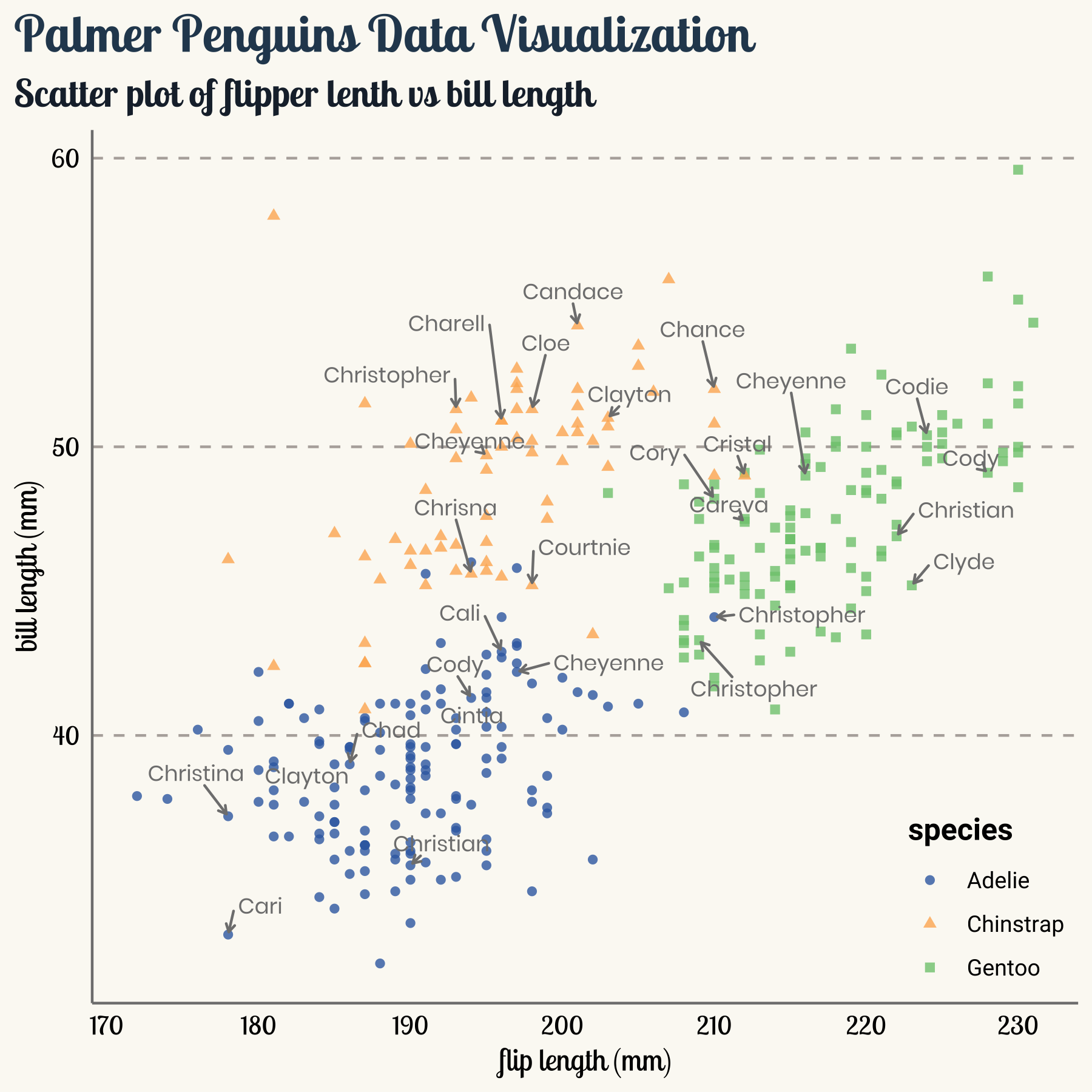
4. Deal with text using ggrepel
ggrepel can help us deal with overlapping text labels. Take the penguins data as an example. Now, the penguins have their own names and we are interested in the penguins with their first name starting with character “C”. I use
randomNames to generate random names.
# Use the randomNames package to create random names. Note that, the results of
# set.seed may depends on R version.
library(ggrepel)
library(randomNames)
set.seed(2021+03+27)
name_vector <- randomNames(nrow(penguins_comp), which.names = "first")

penguins_comp %>%
  mutate(
    name = name_vector,
    highlight = case_when(
      str_starts(name, "C") ~ name,
      TRUE ~ ""
      )) %>%
  ggplot(aes(x=flipper_length_mm, y=bill_length_mm)) +
  geom_point(aes(color=species, shape=species), size=1.5, alpha=0.8) +
  ggrepel::geom_text_repel(
    aes(label=highlight),family = "poppins",size=3,
    min.segment.length = 0, seed = 42, box.padding = 0.5,
    max.overlaps = Inf,
    arrow = arrow(length = unit(0.010, "npc")),
    nudge_x = .15,
    nudge_y = .5,
    color="grey50")+
  scale_color_manual(values = c("#386cb0","#fdb462","#7fc97f")) +
  labs(
    title = "Palmer Penguins Data Visualization",
    subtitle = "Scatter plot of flipper lenth vs bill length",
    x = "flip length (mm)",
    y = "bill length (mm)")
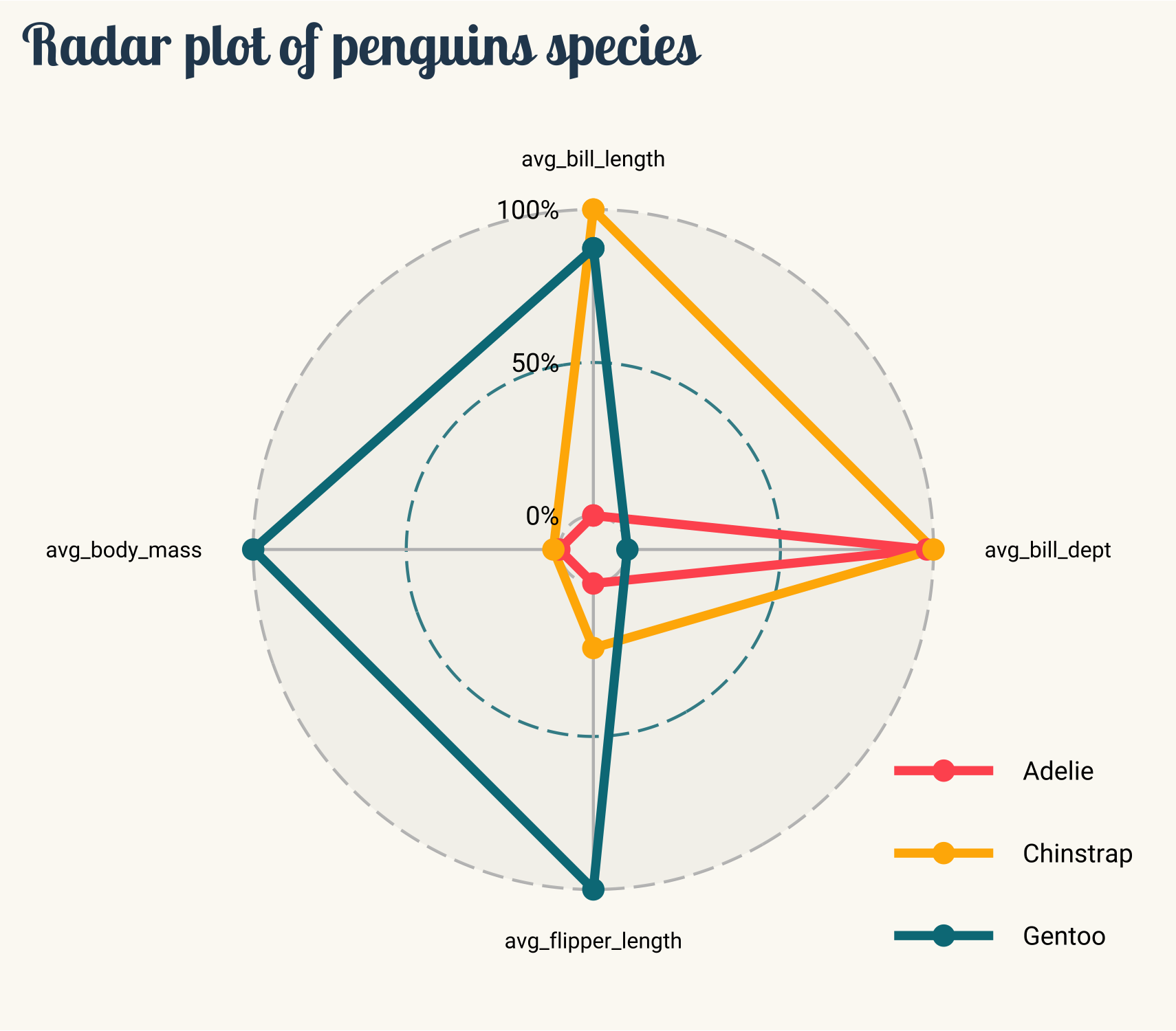
5. Create radar Plot using ggradar
ggradar allows us to make radar plot with ggplot2. We need to reorganize the data.
library(scales)

penguins_comp %>%
  group_by(species) %>%
  summarise(avg_bill_length = mean(bill_length_mm),
            avg_bill_dept = mean(bill_depth_mm),
            avg_flipper_length = mean(flipper_length_mm),
            avg_body_mass = mean(body_mass_g))
## # A tibble: 3 × 5
##   species   avg_bill_length avg_bill_dept avg_flipper_length avg_body_mass
##   <fct>               <dbl>         <dbl>              <dbl>         <dbl>
## 1 Adelie               38.8          18.3               190.         3706.
## 2 Chinstrap            48.8          18.4               196.         3733.
## 3 Gentoo               47.6          15.0               217.         5092.
After group_by and summarise, we need to rescale the values to [0,1].
penguins_comp %>%
  group_by(species) %>%
  summarise(avg_bill_length = mean(bill_length_mm),
            avg_bill_dept = mean(bill_depth_mm),
            avg_flipper_length = mean(flipper_length_mm),
            avg_body_mass = mean(body_mass_g))  %>%
  ungroup() %>%
  mutate_at(vars(-species), rescale)
## # A tibble: 3 × 5
##   species   avg_bill_length avg_bill_dept avg_flipper_length avg_body_mass
##   <fct>               <dbl>         <dbl>              <dbl>         <dbl>
## 1 Adelie              0             0.979              0            0
## 2 Chinstrap           1             1                  0.211        0.0194
## 3 Gentoo              0.874         0                  1            1
Then, put everything together can call the ggradar() function. The result of ggradar() is a ggplot object, which allows us add additional theme features in the plot.
library(ggradar)
library(scales)

penguins_radar <- penguins_comp %>%
  group_by(species) %>%
  summarise(avg_bill_length = mean(bill_length_mm),
            avg_bill_dept = mean(bill_depth_mm),
            avg_flipper_length = mean(flipper_length_mm),
            avg_body_mass = mean(body_mass_g)) %>%
  ungroup() %>%
  mutate_at(vars(-species), rescale)

penguins_radar %>%
  ggradar(
    font.radar = "roboto",
    grid.label.size = 4, axis.label.size = 2.7,
    group.point.size = 3,
    legend.position = "bottom",legend.text.size = 7,
    plot.title = "Radar plot of penguins species") +
  theme(
    legend.text = element_text(size=9, family = "roboto"),
    legend.title = element_text(face="bold", size=12, family = "roboto"),
    legend.position = c(1,0),
    legend.justification = c(1, 0),
    legend.key  = element_rect(fill = NA, color = NA),
    text = element_text(family = "roboto", size = 8, color = "black"),
    plot.title = element_text(family = "lobstertwo", size = 20,
                              face = "bold", color="#2a475e"),
    plot.subtitle = element_text(family = "roboto", size = 15,
                                 face = "bold", color="#1b2838"),
    rect = element_blank(),
    panel.grid.minor = element_blank(),
    panel.grid.major.x = element_blank(),
    plot.title.position = "plot",
    panel.grid.major.y = element_blank(),
    axis.ticks = element_blank(),
    axis.line = element_blank(),
    plot.background = element_rect(fill = '#fbf9f4', color = '#fbf9f4')
  )
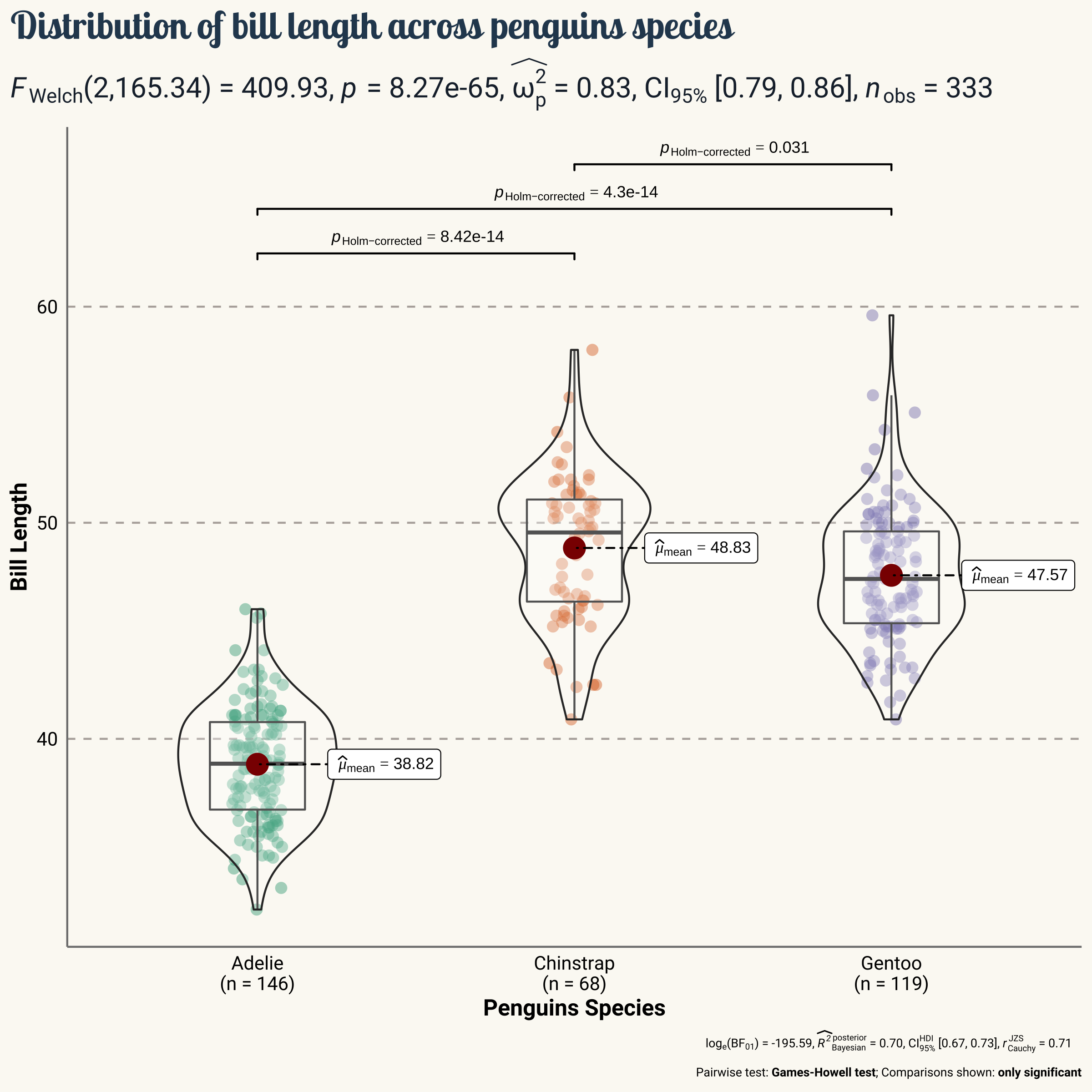
6. Show statistical details using ggstatsplot
ggstatsplot allows us to make plots with details from statistical tests. It is very easy to use. For example, one of the main function in the ggstatsplot package is ggbetweenstats. The result of ggbetweenstats is a ggplot object, which allows us add additional theme features in the plot.
library(ggstatsplot)

ggbetweenstats(
  data = penguins_comp,
  x = species,
  y = bill_length_mm,
  title = "Distribution of bill length across penguins species",
  xlab = "Penguins Species",
  ylab = "Bill Length"
) +
  theme(
    text = element_text(family = "roboto", size = 8, color = "black"),
    plot.title = element_text(family = "lobstertwo", size = 20,
                              face = "bold", color="#2a475e"),
    plot.subtitle = element_text(family = "roboto", size = 15,
                                 face = "bold", color="#1b2838"),
    axis.text = element_text(size = 10, color = "black"),
    axis.title = element_text(size=12),
    rect = element_blank(),
    panel.grid = element_line(color = "#b4aea9"),
    panel.grid.minor = element_blank(),
    panel.grid.major.x = element_blank(),
    plot.title.position = "plot",
    panel.grid.major.y = element_line(linetype="dashed"),
    axis.ticks = element_blank(),
    axis.line = element_line(colour = "grey50"),
    plot.background = element_rect(fill = '#fbf9f4', color = '#fbf9f4')
  )