Themes and Colors in ggplot2
By Tuo Wang in Data Visualization ggplot2
April 25, 2021
In this tutorial, I summarized some useful websites to help us dealing with themes and colors in ggplot2.
ggplot2 allows colors with predefined names and with hex code (e.g.: “#FF0000”). Some predefined color names can be found here:
Besides, I like exploring other color palettes from the following two websites:
Fortunately, some data visualization enthusiasts create some user-friendly R packages with a wide range of many beautiful themes and color palettes.
If you have patience and you can actually create your own themes and color palettes. The official document about modifying ggplot theme can be found
here
For example, here is my most frequently used theme set up.
library(showtext)
library(ggplot2)

font_add_google("Roboto", "roboto")
showtext_auto()

theme_set(theme_bw())
theme_update(
  text = element_text(family = "roboto", size = 8, color = "black"),
  plot.title = element_text(family = "roboto", size = 15,
                            face = "bold", color="#2a475e"),
  plot.subtitle = element_text(family = "roboto", size = 10,
                               face = "bold", color="#1b2838"),
  plot.caption = element_text(size = 10),
  axis.title.y = element_text(face="bold", angle=90),
  axis.title.x = element_text(face="bold"),
  axis.text.x = element_text(size = 10, color = "black"),
  axis.text.y = element_text(size = 10, color = "black"),
  axis.title = element_text(size=12),
  rect = element_blank(),
  panel.grid = element_line(color = "#b4aea9"),
  panel.grid.minor = element_blank(),
  panel.grid.major.x = element_blank(),
  plot.title.position = "plot",
  panel.grid.major.y = element_line(linetype="dashed"),
  axis.ticks = element_blank(),
  axis.line = element_line(colour = "grey50"),
  plot.background = element_rect(fill = '#fbf9f4', color = '#fbf9f4')
)
You can also create your own color palettes:
library(scales)
library(ggplot2)

scale_fill_tuo <- function(...){
      ggplot2::discrete_scale(
        "fill","tuo",
        scales::manual_pal(
          values = c(
            "#386cb0","#fdb462","#7fc97f",
            "#ef3b2c","#662506","#a6cee3",
            "#fb9a99","#984ea3","#ffff33", "#000099")),
        ...)
}

scale_color_tuo <- function(...){
      ggplot2::discrete_scale(
        "colour","tuo",
        scales::manual_pal(
          values = c(
            "#386cb0","#fdb462","#7fc97f",
            "#ef3b2c","#662506","#a6cee3",
            "#fb9a99","#984ea3","#ffff33","#000099")),
        ...)
}
library(tidyverse)
library(palmerpenguins)
penguins_comp <- penguins %>%
drop_na()
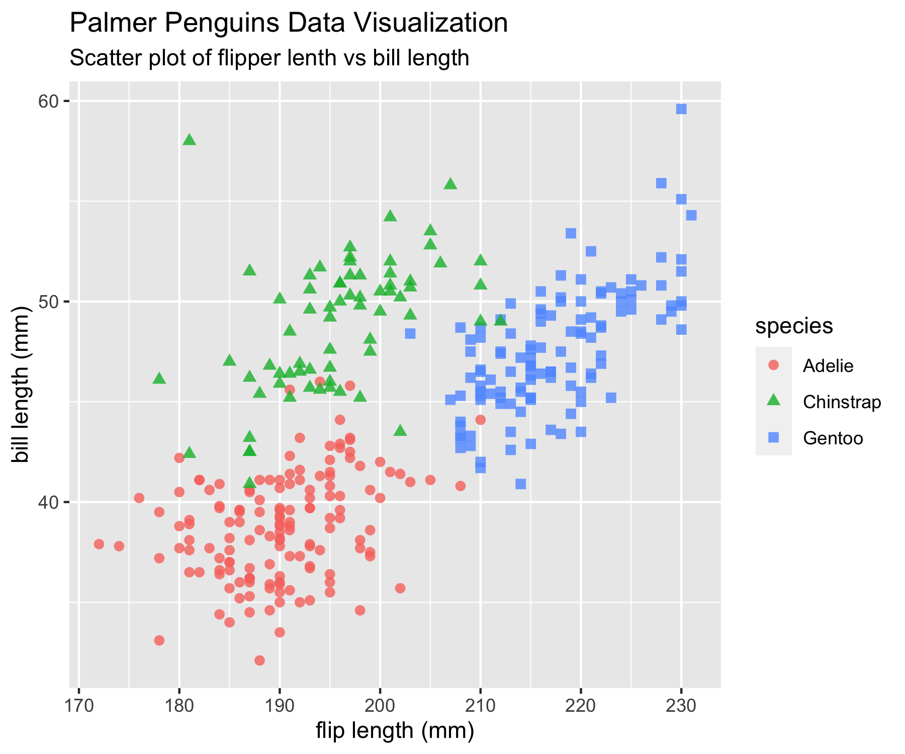
penguins_comp %>%
ggplot(aes(x=flipper_length_mm, y=bill_length_mm)) +
geom_point(aes(color=species, shape=species), size=2, alpha=0.8) +
labs(
title = "Palmer Penguins Data Visualization",
subtitle = "Scatter plot of flipper lenth vs bill length",
x = "flip length (mm)",
y = "bill length (mm)"
)
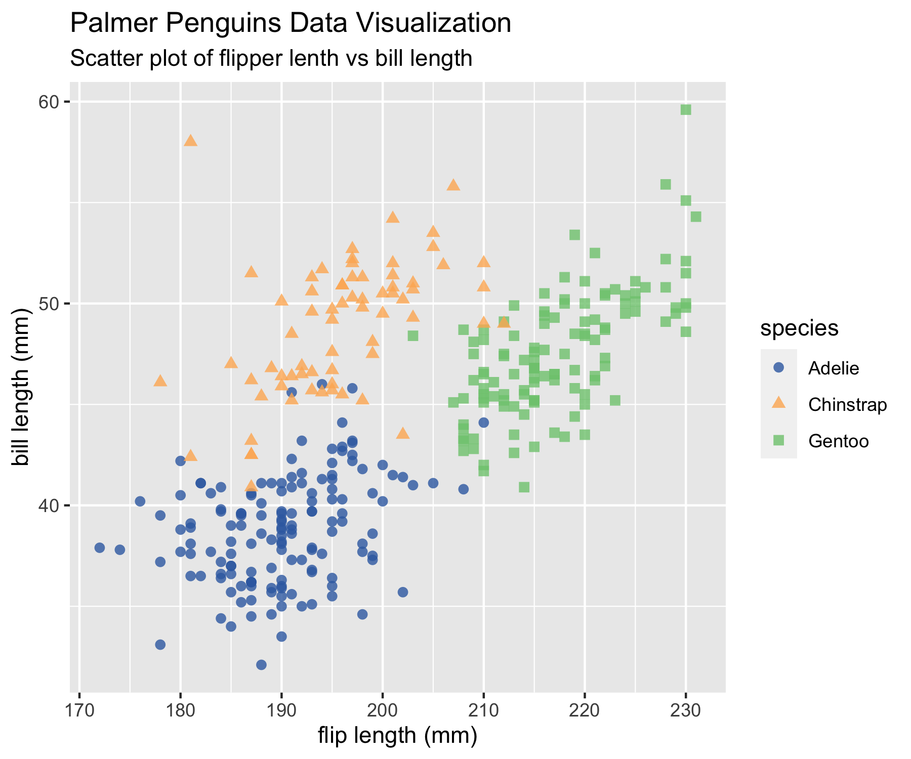
Then we can add scale_colour_tuo() directly after a ggplot object.
penguins_comp %>%
  ggplot(aes(x=flipper_length_mm, y=bill_length_mm)) +
  geom_point(aes(color=species, shape=species), size=2, alpha=0.8) +
  labs(
    title = "Palmer Penguins Data Visualization",
    subtitle = "Scatter plot of flipper lenth vs bill length",
    x = "flip length (mm)",
    y = "bill length (mm)"
  ) +
  scale_color_tuo()
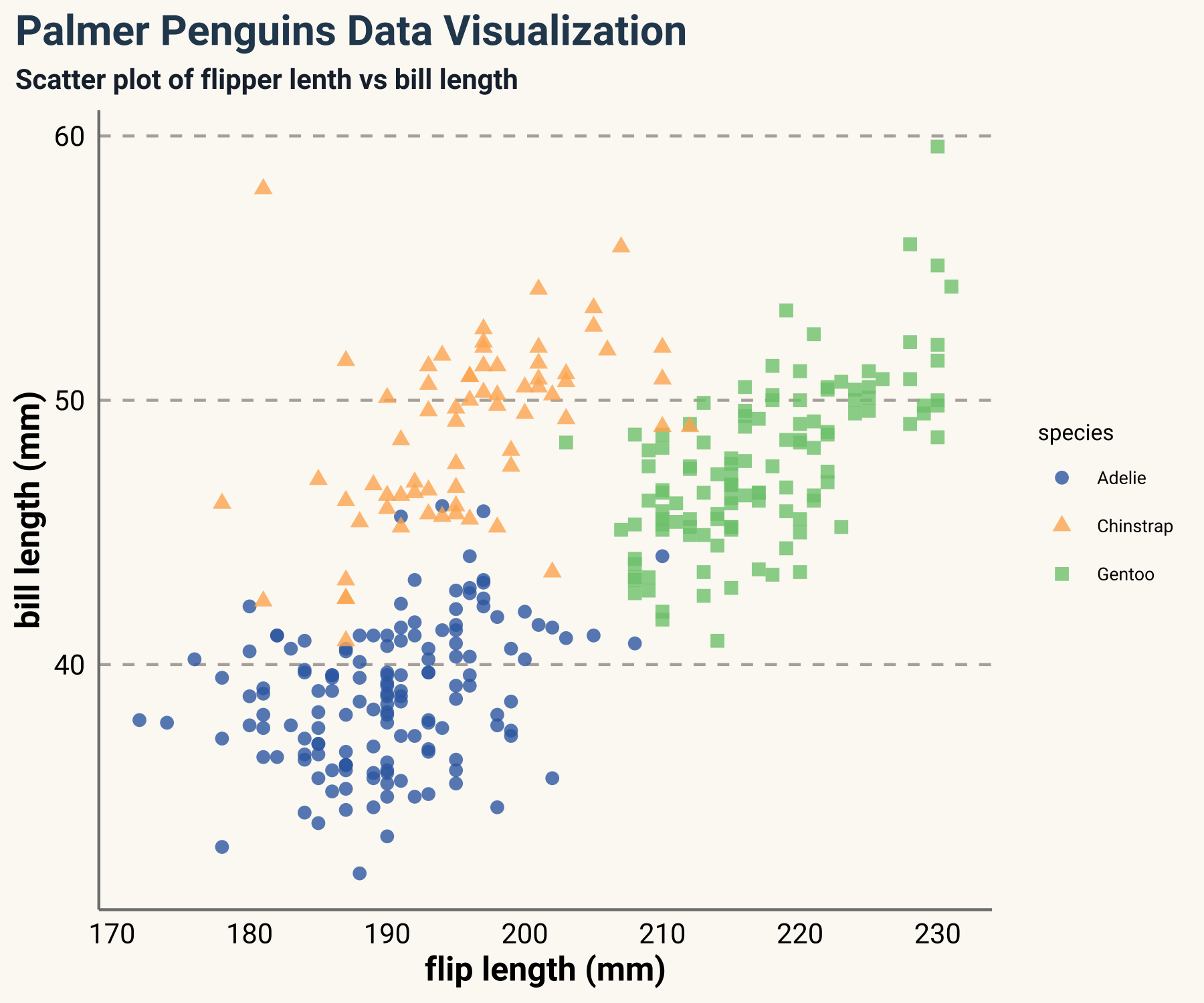
Instead of setting themes at the beginning, you can also create a theme function.
theme_tuo <- function(...){
  library(showtext)
  font_add_google("Roboto", "roboto")
  showtext_auto()
  theme(
    text = element_text(family = "roboto", size = 8, color = "black"),
    plot.title = element_text(family = "roboto", size = 15,
                            face = "bold", color="#2a475e"),
    plot.subtitle = element_text(family = "roboto", size = 10,
                               face = "bold", color="#1b2838"),
    plot.caption = element_text(size = 10),
    axis.title.y = element_text(face="bold", angle=90),
    axis.title.x = element_text(face="bold"),
    axis.text.x = element_text(size = 10, color = "black"),
    axis.text.y = element_text(size = 10, color = "black"),
    axis.title = element_text(size=12),
    rect = element_blank(),
    panel.grid = element_line(color = "#b4aea9"),
    panel.grid.minor = element_blank(),
    panel.grid.major.x = element_blank(),
    plot.title.position = "plot",
    panel.grid.major.y = element_line(linetype="dashed"),
    axis.ticks = element_blank(),
    axis.line = element_line(colour = "grey50"),
    plot.background = element_rect(fill = '#fbf9f4', color = '#fbf9f4')
    )
}
penguins_comp %>%
  ggplot(aes(x=flipper_length_mm, y=bill_length_mm)) +
  geom_point(aes(color=species, shape=species), size=2, alpha=0.8) +
  labs(
    title = "Palmer Penguins Data Visualization",
    subtitle = "Scatter plot of flipper lenth vs bill length",
    x = "flip length (mm)",
    y = "bill length (mm)"
  ) +
  scale_color_tuo()+
  theme_tuo()
- Posted on:
- April 25, 2021
- Length:
- 3 minute read, 552 words
- Categories:
- Data Visualization ggplot2
- See Also: